Wednesday, February 27, 2013
PTU: Supa Bass
Tut by: KillerKitty
Written on: 2/26/13
This tut was written by me on 2/26/13, any similarity to any other tut or tag is purely coincidental.
This tut is written using Photoshop CS5, but should work with CS1 and up. This tut is written for beginners.
Supplies:
Kit: Supa Bass by Designz by Baby Dragon (Available here)
Tube: Miaka by Wasabi (Available here)
Mask: DBV Mask 147 by Vaybs (Available here)
Font: Rock Salt
TUTORIAL:
Make a new document 800x800. If you want to have it at 300 dpi like I do it's fine, because at the end of the tut we are going to fix it to where it is 72 to follow the TOU's.
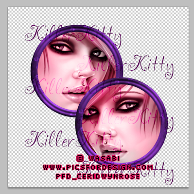
We are now going to be adding our tube. I chose Miaka by Wasabi, and I moved the layer named 3 onto my tag.
I resized her to 71% of her original size and moved her to the left circle to make it look like she was sitting on the circle frame.
Now open SB Paper 2 and move it onto your canvas. Put it below the frame layer, and get your magic wand tool. Select your frame layer, and use the magic want tool on the outside of the frame.
Now go to Select menu ---> Modify ---> Expand ---> 5 pix (I do this to keep the edge of the paper from looking weird. Click on your layer with the paper and hit the delete button. Deselect.
Make a copy and flip horizontal. Move her up to the other part of the frame. I try to get them to look the same, just flipped. Now you see that pesky shoulder is in the way.
So what we are going to do is to bust out that Magic Wand Tool agian. (It's one of my favorites.) Make sure your frame layer is selected and click in the lower right circle, then Select ---> Modify ---> Expand ---> 5 px. Click on the tube layer and then delete. Now make sure your frame layer is selected again, click outside the circles, then Select ---> Modify ---> Expand ---> 5 px. Click the top tube layer, then delete, now click the bottom tube layer and then delete. Now go back to that frame layer, click the top circle, then Select ---> Modify ---> Expand ---> 5 px, and now click on the bottom tube layer then click delete.
Now we are going to mess with the layer blends. Now there are a few ways to do this but I mostly just do it from the layers box.
Now click the little dropdown arrow and click on Luminosity, making sure that you have the bottom tube layer selected. Now you are going to select the tube layer above that one and do the same layer blending effect.
Now you are going to copy those two tube layers, and we are going to change the blending to soft light. Then in the box next to the layer blending is the layer opacity. We are going to set that at 50%
Now we are going to start adding elements to our tag. You guys go ahead and take some artistic freedom with this area. (If you want to use the exact layout I did I will be adding a cluster frame at the end, but I think this is more fun than to just open a cluster and bam instant tag.)
Open DBV Mask 147 by Vaybs and double click on the “Background” layer. A box will pop up saying “New Layer” just click OK.
Now make a new layer and flood fill it with this color: e44180 (That is a hex code for a color). Move Layer 1 under Layer 0, then click on Channels. Hold down the Ctrl button and click on the top layer that says RGB, and you will see a selection. Click back over to the tab that says Layers, and hide Layer 0. Click on Layer 1 and then click on the Add Layer Mask button.
Go back over to your tag and we are going to resize it to 650x650. Now take that mask you just colored and move it over to your tag canvas and put it on the bottom of it.
Now go to your type tool and click on it. We are going to be using a text called Rock Salt at 18 px. It is a FTU font. We are using the same color as the mask. Type in your name. Go to Layer effects, Bevel (size 5) and Stroke at 2 px. Now add your licensing and stuff.
Now I know what you are thinking, "Oh my gosh everything is still at 300 dpi!!" Well super easy for Photoshop. You go to File ---> Save For Web & Devices and save as Png-24 with transparency. Now it is 72 dpi like TOU states it needs to be.
Hope you all enjoyed this tutorial!!
Here is the link for the Cluster Frame.

Subscribe to:
Post Comments
(Atom)
About Me

- KillerKitty
- I love to play with Photoshop/Paint Shop Pro. I am an amateur (seriously) graphics artist.
Powered by Blogger.
Search This Blog
Followers
Labels
- Alikas Scraps (2)
- Camilla Drakenborg (1)
- Designs By Vaybs (7)
- Designz By Baby Dragon (2)
- Irish Princess Designs (5)
- Ismael Rac (4)
- Millies Psp Madness (1)
- MissyMinx (1)
- PTU (11)
- Rissas Designs (2)
- Tag (5)
- TonyT (3)
- Tut (5)
- VeryMany (3)
- Wasabi (1)


0 comments:
Post a Comment